品牌Logo视觉设计 #3
Creator: Oscar
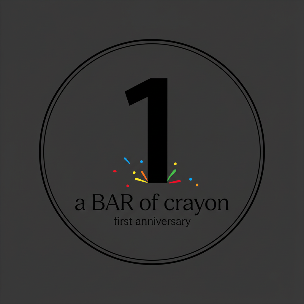
Minimalist and elegant logo design for a bar's 1st anniversary. Bar name: "a BAR of crayon". Central focus is a bold, oversized numeral "1" (very prominent, taking up most of the composition). Clean sans-serif or slightly geometric shape for the "1". The bar name is placed neatly below or beside the "1" in a refined, thin uppercase/lowercase mix. Color scheme: mostly monochrome (black, white, or deep charcoal background) with small playful color accents – a few tiny dots, short strokes, or abstract shapes in bright crayon colors (red, yellow, blue, green, orange) scattered subtly around the "1" or the name. No excessive details. Overall feeling: sophisticated, airy, celebratory but not loud. The "1" should be unmistakably dominant. Optional: very discreet "st" or "first anniversary" text, but keep it secondary. The logo must work for a bar's anniversary branding – stylish and memorable.